The log · 12 September 2026 · design
An identity, drawn with an agent
I used Claude to develop a logo for Flyback from OmaCRT's existing design. This is how we went from three proposals to a finished mark, including two rounds of feedback and a crop measurement the agent got wrong.
subject
a mark for Flyback, drawn as a sibling of OmaCRT's
brief
my initial request, in Italian
tools
rectangles on a 44 unit grid, written as SVG
image generators
none
17pxthe difference in left side bearing that made the two lines look misaligned
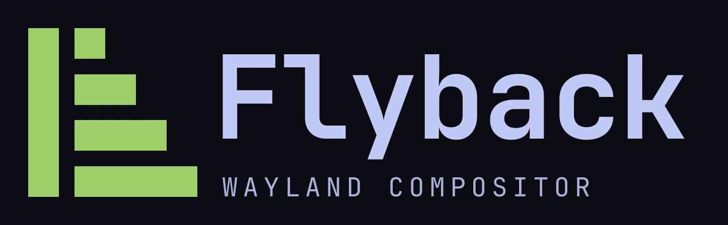
I asked Claude: _"un logo per Flyback compositor con /design dai un brief adeguato"_. I wanted a logo for the compositor and asked the agent to develop the brief. The repository already contained the project context and the geometry of OmaCRT’s mark, which the new logo needed to share.
01Starting from the existing mark
OmaCRT’s mark has four bars crossed by a dark cut representing the beam’s return between lines. Its geometry is defined by a struct, with the reasoning in the comment above it:
pub const RETRACE: Retrace = Retrace {
    grid: 44, bars: 4, thick: 8, gap: 4, cut: 12, minseg: 3, rest: -2,
};
The grid is forty four units square. The bars are eight units thick, with four units between them. A twelve-unit cut steps once per bar to form a 45-degree edge. The accompanying note explains why five bars become unreadable at 24 pixels; the shape needs to survive scaling without a separate small-size version.
The agent read those constraints first. They gave it a grid and a set of proportions for the new mark.
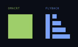
OmaCRT’s cut moves down and to the left. Flyback’s ramp steps down and to the right. Both use the same grid.
02Three directions, each with the case against it
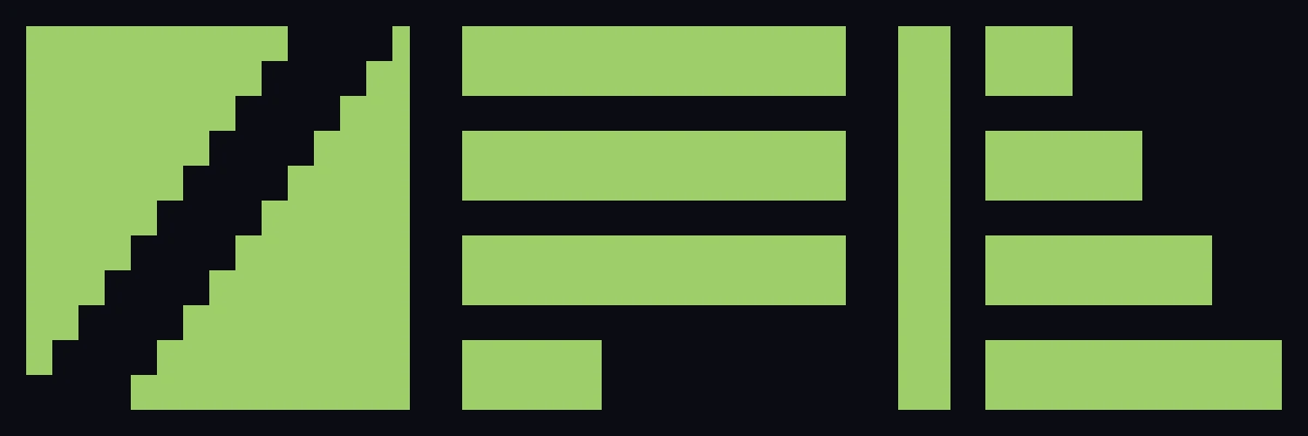
The name suggested the subject. Flyback is what a television’s deflection does between two lines: the current ramps across the screen, then collapses back in almost no time. The transformer named after it is the part tuned for one line rate and no other.
The agent proposed three directions: a whole raster with a staircase cut through it; a raster caught mid scan, with the last bar stopping a third of the way across; and a deflection waveform, with four bars stepping out beside a full height return stroke.
Each proposal included a For and an Against. The drawback listed for the version I chose was:
the least literal of the three; someone who has never seen a deflection waveform reads it as an abstract monogram, not as a beam.
I chose C and replied: _"Ok per la C vai avanti"_.
03The refinement was a number

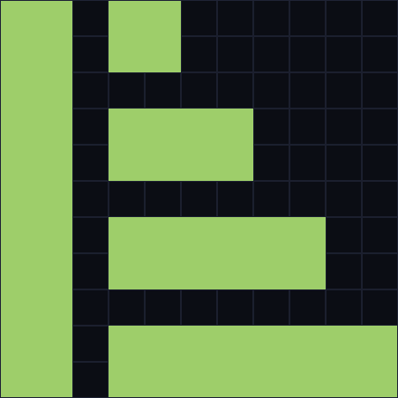
In the sketch the return stroke was six units wide. In the finished mark it is eight, the same weight as a bar.
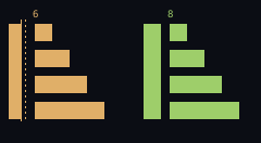
The return stroke represents the same beam travelling about a hundred times faster. Giving it the same weight as the bars makes that relationship visible. At six units it introduced a second weight into the eight-thick, four-apart rhythm, which was especially noticeable at small sizes.
The construction uses these dimensions:
| grid | 44 by 44 | shared with OmaCRT |
| bar thickness | 8 | same |
| gap | 4 | same |
| pitch | 12 | same |
| return stroke | 8 by 44 | one bar, stood up |
| stroke to bars | 4 | the gap again |
| bar widths | 8, 16, 24, 32 | a step of 8 |
| bars end at | 44 | flush right |
| smallest feature | 8 units | 2.9 pixels at 16 px |
The same SVG rendered at 176, 64, 32, 24 and 16 pixels:

These dimensions also give future variations a consistent starting point.
04Drawing for a 240-line screen
The mark has to be drawable by an electron beam on 240 scan lines, because this project's marks appear on the television it drives. That is why there are no diagonals, no hairlines and no fractional units anywhere in the system.
The display constraint informed the grid and stroke weight.
05The first critique, and the seventeen pixels
When I looked at the logo and text together, the second line seemed misaligned and its contrast was too low. I asked the agent to address both.
In a monospaced font, each glyph occupies the same advance width, but the space before its visible ink can differ. That space is its left side bearing. A capital F at 230 px carries 18 px of bearing, and a capital W at 52 px carries 1. Set to the same x coordinate, the two lines are aligned on their origins and misaligned on their ink by seventeen pixels. The smaller line's ink hangs out to the left, exactly what the eye was seeing.
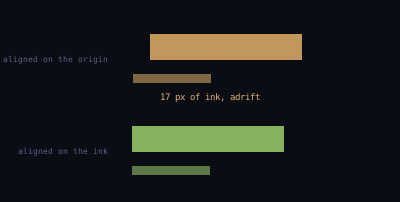
The agent aligned the visible ink, then cropped and trimmed both text bands to check the result. Both started at column 442. It also increased the contrast of the second line while keeping it less prominent than the wordmark.
The agent also found a third problem: the descender of the _y_ in Flyback ran into the second line’s cap height. It moved the word up 16 px and the second line down 16 px, keeping the block centred on the mark.
06The second critique, and a measurement that was wrong
In the next version, _Wayland compositor_ still did not line up with the mark. I suggested aligning it with the bottom bar.
The agent measured the wordmark’s ink at rows 92 to 301 and the second line at 317 to 356, both starting at column 442. It measured the bottom bar at rows 352 to 391 and reported a height of 39 px. Since it also reported the second line as 39 px tall, it proposed moving the line down 35 px to align the two bands.
The bar measurement was wrong. The agent had cropped across its full width, including columns occupied by the bars above it. Measuring only the part where the last bar is isolated gives rows 331 to 391, 61 px. The two reported heights of 39 px did not establish an alignment.
| first crop | corrected crop | |
|---|---|---|
| columns measured | 148 to 391, the bar's full span | 340 to 380, the bar alone |
| what is in them | the last bar and three above it | the last bar |
| rows reported | 352 to 391 | 331 to 391 |
| bar height | 39 px | 61 px |
Moving the line still made sense. Its band, 317 to 356, crossed the bar’s band, 331 to 391, about a quarter of the way down, without aligning to either edge. The revision aligned the text baseline with the bar’s bottom edge: second line ink at 352 to 391, bar at 331 to 391.
The agent had predicted that moving the line down 35 px would leave a 51 px gap under the wordmark. The wordmark could now move back down the 16 px added earlier, since the second line was 35 px further away. The final file measures:
| rows | ||
|---|---|---|
| the mark | 56 to 391 | 336 px square |
| the wordmark's cap height | 108 to 275 | 168 px, half the mark exactly |
| the descender of the _y_ | to 317 | clears the line below by 35 px |
| the second line | 352 to 391 | its baseline on the bar's bottom edge |
| the last bar | 331 to 391 |
The second round exposed a limit of the process: a plausible alignment proposal had been supported by an incorrect measurement. Checking the crop changed the explanation and preserved the intended alignment.
07The rules, and four ways to get them wrong
The specification has three sheets: construction; colour, clear space and misuse; and the two marks with their wordmarks. The misuse sheet shows four changes to avoid: rotation, gradients, outlines and five bars instead of four.
Clear space, and four things it is not.
The sheet of the specification that gets skipped. The clear space is the mark’s own gap, and the four wrong ones were all drawn by asking for the mark and getting something else.
Clear space is four units, the gap between the bars again.
The four colour combinations have these measured contrast ratios: Phosphor green on the near black the launcher uses, at 10.6 to one. The paper colour on the same ground, at 12.0. The dark ink on paper, at 16.2, the one print and a light theme get. And the mark knocked out of the green, the same 10.6 the other way round.
Four grounds, and each one measured.
The green is a mark colour with one ground, and it has one ground. Every ratio here is worked out from the two colours.
The green is a mark colour with one ground. On white it measures 1.8 to one, too little contrast for this use, so a light theme gets the dark ink. There is a second file for that, flyback-mark-mono.svg, which takes currentColor and lets the page decide.
The OmaCRT mark, as the tube draws it.
Forty four scan lines, top to bottom, at the speed a television draws them. Every bar is still four lines thick at the bottom of the frame, the whole reason the mark is built out of eights and fours.
08What it does not show
The agent wrote the SVG as rectangles on a 44 unit grid. No image generator was used.
I reviewed four versions on a canvas on my phone: the three directions, the refined mark and its rules, the first corrections, and the final alignment. The repository contains the working files, including the two unused directions.
The existing geometry gave the agent a useful constraint. It could propose related marks, render them at different sizes and document their construction in the same repository.
That does not make the choice of mark an arithmetic result. All three proposals used the deflection waveform as their subject; a different designer could have explored other ideas. I chose which direction to develop and judged the revisions visually.
The brief, proposals, specification, assets and two feedback rounds took an afternoon. The measurements helped refine the result, but they also needed checking.